We recently developed a logo for the Lily Pad Cafe, a newly launched food service area located inside HOP Shops. HOP Shops is a chain of convenience and fuel stores located in northern Kentucky and southwest Ohio that are owned and operated by Valor Oil.
We had created the logo for HOP Shops in 2018, when Valor Oil undertook a rebranding effort for the recently acquired stores. HOP Shops had used a kangaroo mascot up to that time, but Valor Oil wanted to move in a new direction.
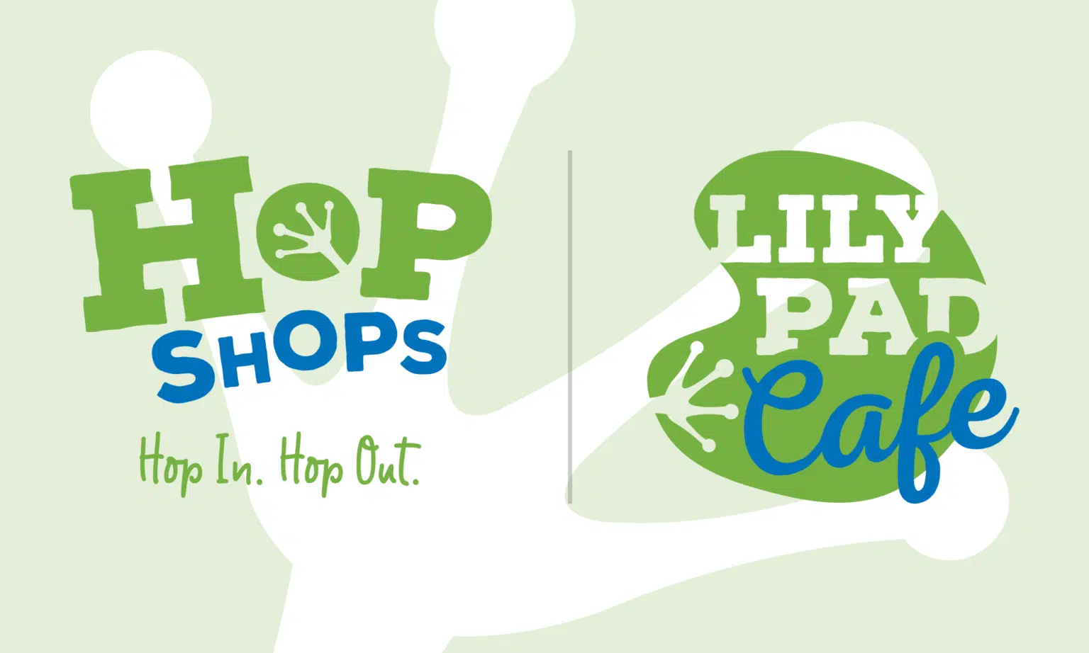
In keeping with the store name and “Hop In. Hop Out.” tagline, we created a new identity around a hopping mascot more common to the region – a frog.
To keep the design simple and scalable we focused on the unique footprint of a frog, incorporating that unmistakable impression into the negative space of the “O” in HOP.
We created a fun, bold, and modern logo that offers excellent storefront visibility from the road while looking great on uniform shirts, cups, mugs, and other swag.
With the new logo for the Lilly Pad Cafe concept, Valor Oil wanted an identity with a similar feel to HOP Shops so that the two brands would feel connected but distinct.
We created a badge logo combining a lily pad with the signature frog footprint and the same heavy lettering in the HOP Shops mark – and introduced a bold script typeface. The elements fill the shape of the lily page for a balanced, integrated design.
When you are in northern Kentucky or southwest Ohio and need fuel and refreshments, be sure to hop in to HOP Shops and check out the Lily Pad Cafe.