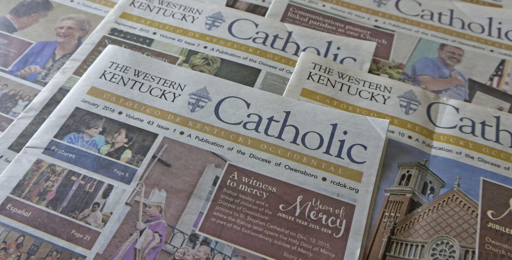
Red Pixel Studios was selected to develop a new design for The Western Kentucky Catholic, a newspaper published by the Diocese of Owensboro, mailed to member households and distributed to every Catholic parish and school in the Diocese.
About the Project
The Western Kentucky Catholic is the official newspaper of the Diocese of Owensboro and is published 10 times per year. It began modestly as The Bishop’s Newsletter and in the mid-1980’s was transformed into a comprehensive newspaper that aimed to cover events, schools and parishes within the entire Diocese.
Mel Howard, former Catholic schools English teacher, published the newspaper each month. His roles included photography, writing, editing and laying out each issue. Mel’s retirement in May 2015 marked the end of a 30-plus-year era as editor of The Western Kentucky Catholic. The Diocese of Owensboro then sought to have the newspaper redesigned to signal a new era and make publishing more efficient for the new editor, Elizabeth Barnstead, and the communications staff.
The Challenge
The Diocese of Owensboro wanted a newspaper that delivers important information about the topics and events of the Catholic Church in Western Kentucky, in a format that readers could easily consume, with consistency from month to month. The readership was paramount.
The Diocese of Owensboro established a requirement that the newspaper template must be easy for their communications staff to insert content and photos. They also had specific enhancements in mind, including the following:
- Make articles easier to read for the elderly
- Create layouts that break up large amounts of text
- Develop a front page template that would attract attention and prompt parishioners to pick up the newspaper
- Create standard sections to make the publication easier to consume
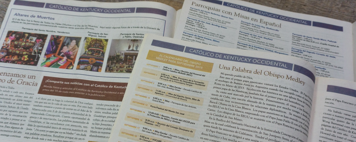
- Distinguish the section featuring the Bishop’s letter and calendar
- Make the Spanish section more inclusive
- Enable a consistent look for each issue
- Create standard ad sizes for each issue
- Develop a layout that attempts to deliver the same amount of news using fewer pages
Our Approach
Having previously worked with the Diocese on numerous projects, we had begun to establish a growing visual identity and wanted to extend that by incorporating their branding into the design of the new The Western Kentucky Catholic.
We extensively reviewed other similarly-sized Catholic newspapers that the Diocese of Owensboro staff enjoyed reading, noting the characteristics they had in common as well as certain features unique to each of the papers.
Based on this research and conversations with the client, we focused the redesign on creating a publication that both invited readers to pick up the paper and enticed them to flip through each page.
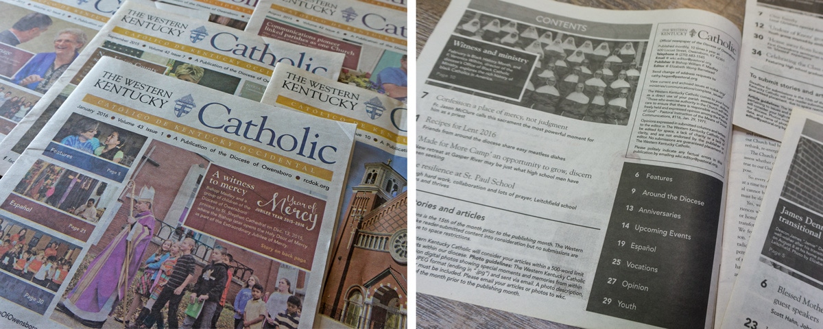
We began with the cover, creating a template that would prominently feature images and display coverlines to highlight articles for that month and indicate the inside location of each.
To make the newspaper more identifiable we incorporated a color scheme and fonts often used in other diocesan materials.
We added a table of contents to make it easier for readers to peruse the newly established sections.
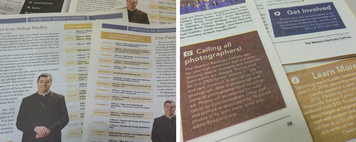
We highlighted the message and activities of the Bishop more prominently with a consistent look in each issue while bringing focus to those popular monthly features. Throughout the newspaper, we introduced common elements such as call-out boxes and icons that could be used in any section – creating consistency and tying the newspaper together.
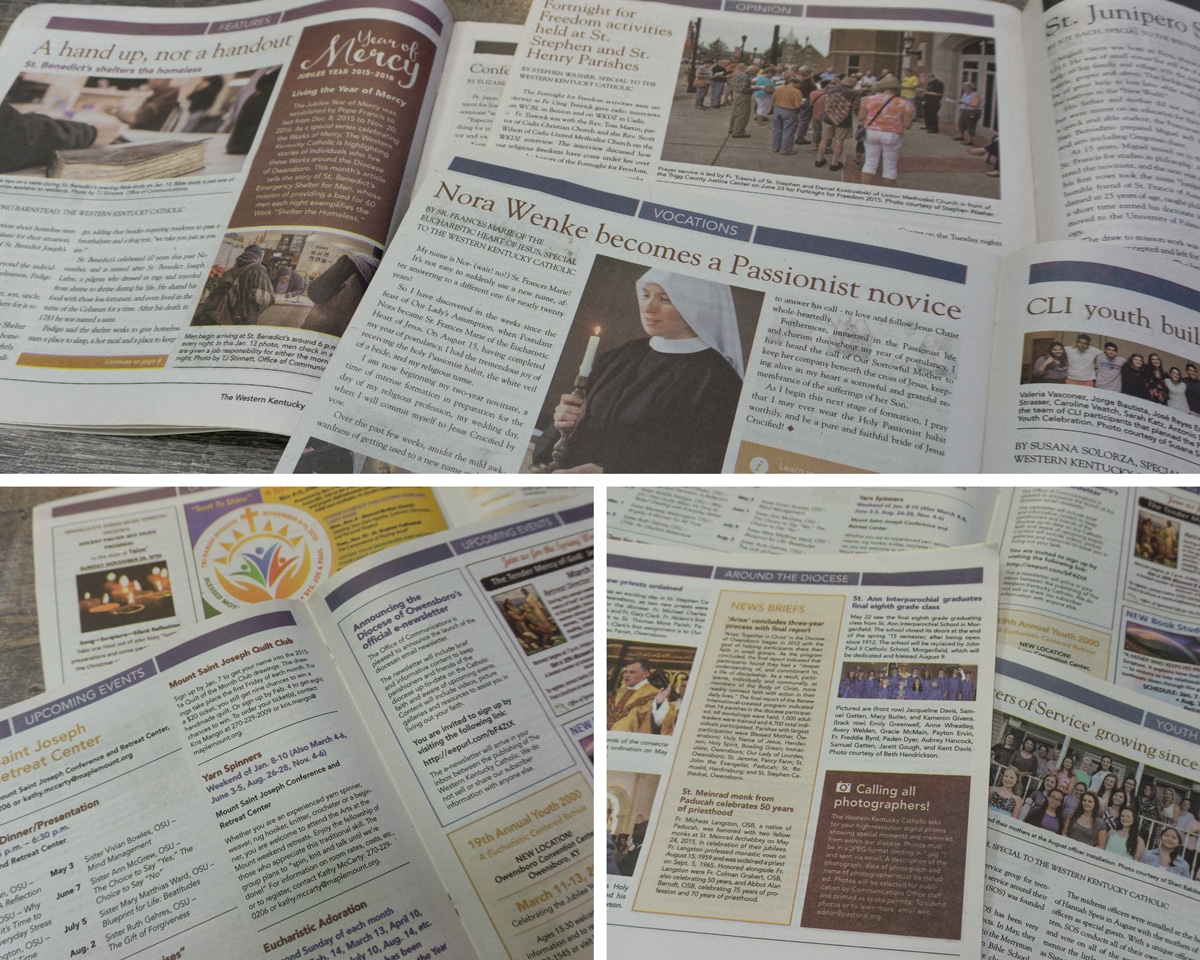
To help make the layout process easier for the new Diocesan staff, we set up style sheets and master spreads. We refined the templates and smoothed the publication process by designing and laying out the first 10 issues of the paper. This allowed us to make revisions to elements and templates, ensuring that copy editors could easily incorporate almost any type of content for future issues.
In August 2016, Diocesan staff completely took over publication of The Western Kentucky Catholic.
The Results
With our work on the design and layout, The Western Kentucky Catholic is now a more condensed newspaper that each month has a consistent look that is instantly recognizable as a publication by the Diocese of Owensboro. It is also easier to consume with the addition of sections, a table of contents page and attractive promo images on the cover.
Because The Western Kentucky Catholic is mailed to member households, objective measurements, such as comparisons of of circulation before and after, are not especially meaningful. So we considered results based on the feedback of the readership – the most important audience – as well as the editor and staff that produce the newspaper.
Parishioner Feedback
Feedback from readers has been overwhelmingly positive. The communications staff received and collected numerous comments during the time that we were publishing and refining the newspaper, some of which are provided below.
Volume 42, Issue 6 – August 2015
“I have been hearing positive reports from numerous people on the WKC. Readers, parishioners and diocesan staff have all mentioned how impressed they are.”
Volume 42, Issue 7 – September 2015
“I’ve been getting some good responses for the September issue! People who seemed to have missed the August one are speaking very highly of this one. Maybe the shorter length is less intimidating? (Although I did have one or two “it seems smaller” inquiries.) At any rate, keep up the great work!”
Volume 42, Issue 10 – December 2015
“Many readers have complimented the use of a larger font.”
“I picked up my copies of the December WKC yesterday, and it looks great! The handful of people who have already seen it are quite impressed with it. Great job!”
Volume 43, Issue 1 – January 2016
“This morning I received a very nice message from a reader that she is greatly enjoying the new WKC design. She said it has an ‘overall clean, professional look with a great layout with white spaces. Very pleasing to the eye.’ I thought you would appreciate that! I’d say our audience is generally quite happy with the paper!”
Volume 43, Issue 3 – March 2016
“I received more compliments from a couple readers about the redesign… they’re still very happy with how everything looks.”
Volume 43, Issue 5 – May 2016
“Amanda’s design work is truly priceless and I’m very grateful for the months spent working with her on our diocese newspaper! I’ve heard numerous positive comments from readers thanks to her initiative with our redesign.”
Communications Staff Feedback
In addition the editor and staff provided feedback after they took over production:
“Once we brought the new spaper layout in-house, the templates made the transition a hundred times easier and give us a lot more time to focus on the quality of our content.”
“Red Pixel Studios completely removed the intimidation factor associated with putting together a 32-page monthly newspaper. Thanks to their template for The Western Kentucky Catholic and training on how to use it, laying out each issue feels less like work and more like putting together a fun puzzle.”
