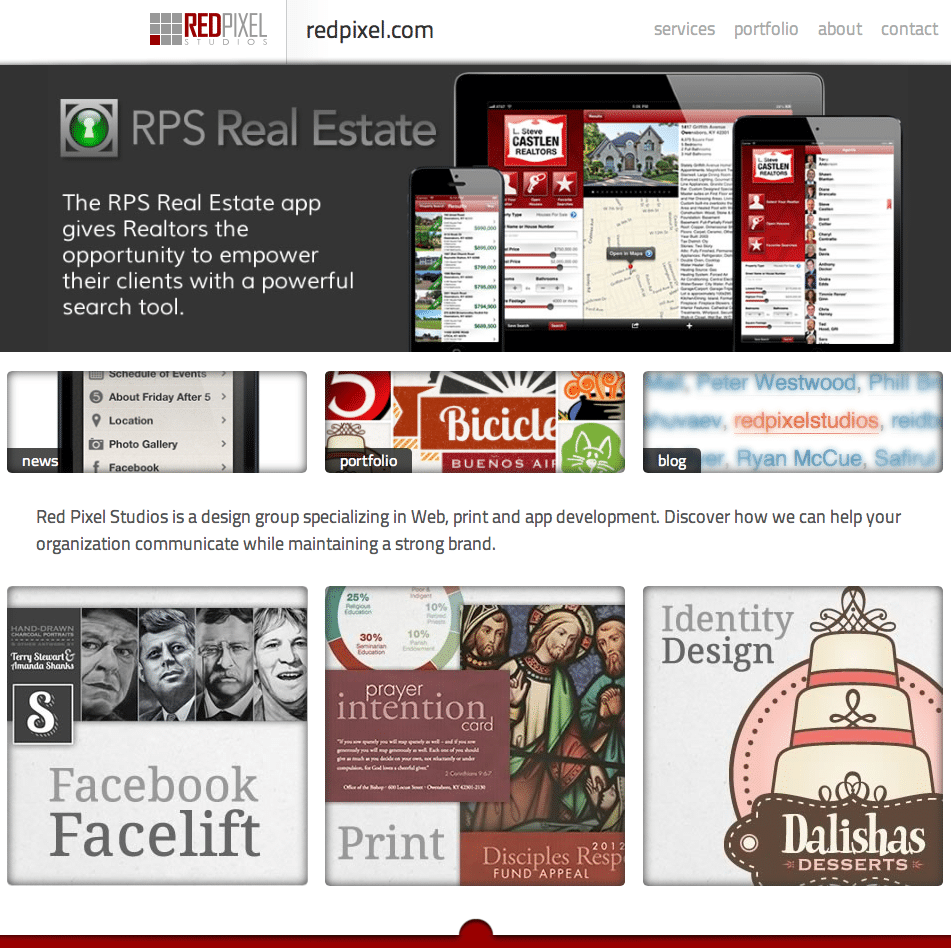
Red Pixel Studios unveiled its new Web site today at redpixel.com, consolidating content from a number of subdomains into a unified presence and providing a much easier way for visitors to consume information about our work.
The new site is responsive, so pages display differently depending on the screen size of the device on which it is being viewed. By designing layouts for phones, tablets and desktops, we are able to provide an optimal experience for any visitor.
Aside from flexibility in target devices, the new page design gives us additional options for presenting content. A larger, thinner typeface makes the site easier to read. While we don’t encourage it – think green – if you decide to print pages from the site you will automatically get a printer-friendly version.
As both the previous site and the new site were developed using WordPress as our Content Management System, the transition was as easy as applying a new theme. We kept the same structure as before, so after a few tweaks here and there we were ready to go.
We have even more plans for the new design in the very near future. Check back soon to see what’s in store!
